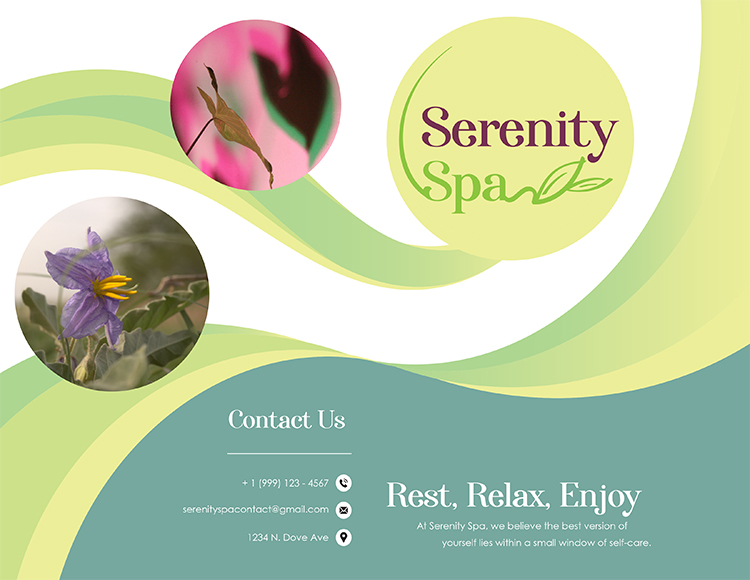
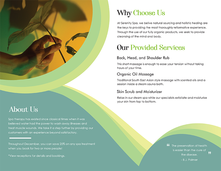
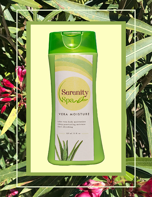
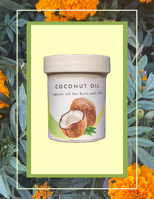
Serenity Spa
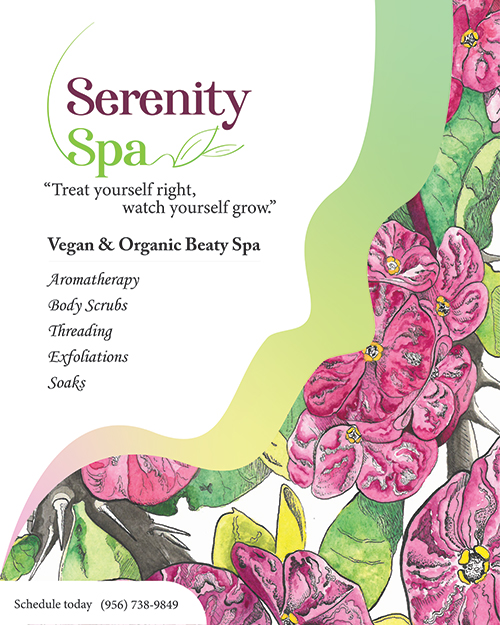
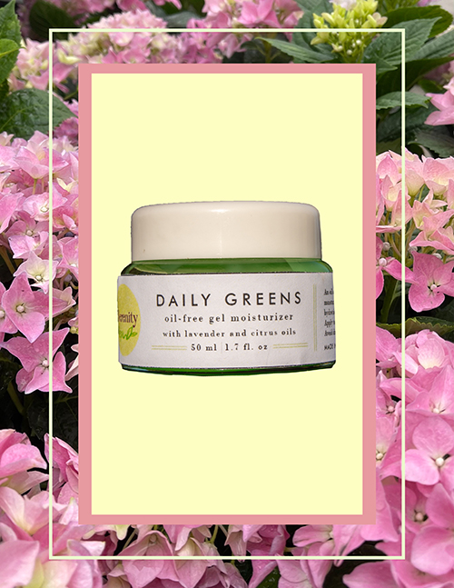
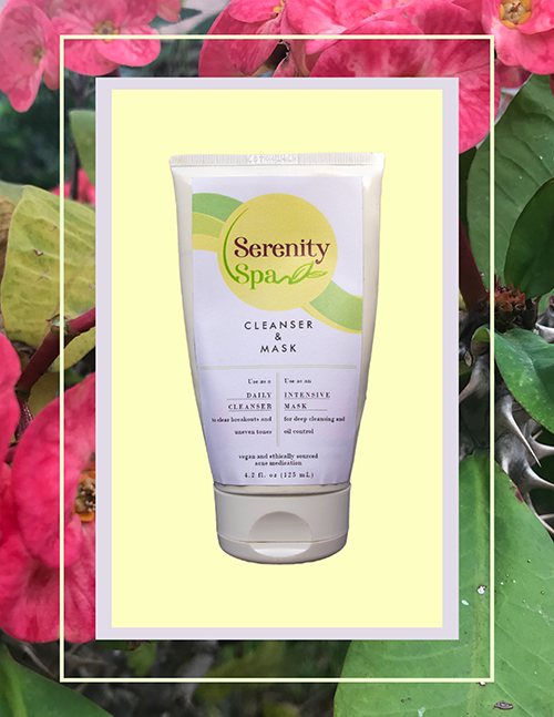
The logo itself was made by swipes of my own finger on my touch screen laptop using Illustrator. This gave the logo a natural appearance. I kept this idea going by creating curly designs spanning across the entire layout of the page for the flyer, as well as the packaging designs I created. My exhibit stemmed from the idea of products and services I would purchase for myself. Using rich bright colors and organic shapes, I tried to convey very peaceful designs. I specialize in creating water color paintings. One of my main focuses is painting plants, so it felt very natural to create a painting to represent the organic, lively nature of the brand I developed. It pushed me into the direction of attributing vegan products and holistic treatments to the spa, which helped me add another layer of identity to the concept. I gravitate towards products that are generally less processed and refined. I imagined if I ever went to a spa, I would want only the most natural and pure use of substances on my body. Incorporating clean design into the concept of the spa helps to convey clean products. The flyer created to advertise and list of services from the spa was purposefully created to appear neat, simple, and easy to look at,enough to make you think that the business has some theme to it. Using Photoshop, I created more designs for the products by adjusting layer transparencies and creating clipping masks. My main goal was to create something that was pleasing to look at, if even for a moment.