Kniflight
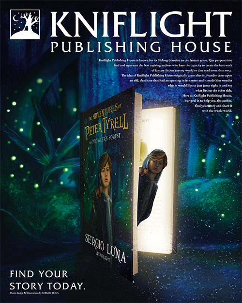
For my senior exhibit project, I wanted to create a publishing house that specializes in fantasy fiction because I love to read and write fantasy, as well as design book covers. The idea originally came to me when I came across an actual dead tree that had a hole in it and it made me wonder if there was another world inside, which is why I decided
to use it for the publishing house logo. The name Kniflight came to me when I was trying to come up with names that sounded like “fantasy” and “publishing company, and the first word that popped into my mind was “knight,” then I tried to combine it with another word to make one word. After so many tries, the word “light” came to me, and then I realized that it went perfectly well with the logo design.
I had been designing and printing physical copies of books for a few years now, so I used all of my knowledge and experience and applied them into this senior exhibit project. Since I am a huge fan of Scholastic and Harper-Collins books, like Harry Potter and Starfell, I applied my graphic design skills into designing my copy of the book from
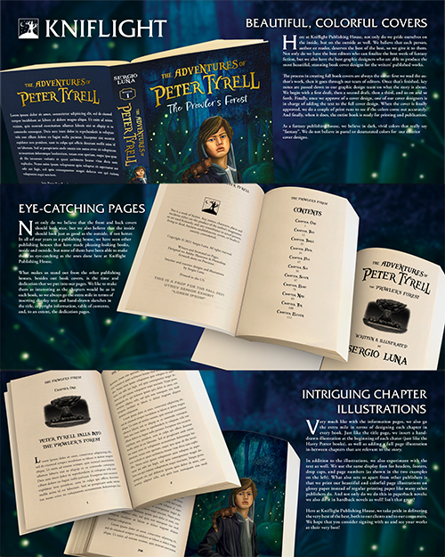
the inside and out. The first thing I did was make a beautiful illustration for the front cover, then I created the title of the book (“The Adventures of Peter Tyrell: The Prowler’s Forest”) in a special font.
The next thing I did was the interior manuscript design, but I didn’t want it to be just any old plain manuscript; I wanted to make it stand out from the other books. I created a black and white pencil illustration for each chapter and a colorful illustration for a whole page. I got the inspiration from the Harry Potter as well as The Dark Tower books in this stage of the project.
The next thing I did was the full book cover design. Since I have been using the same printer/publisher for quite some time now, I was able to get the dimensions for the front and back cover, as well as the spine, from them once I uploaded the interior manuscript. Since I already had a front and back cover ready to go, the last thing I needed to do was the spine, which was my favorite part because I was able to use the spine design from the Starfell book that I love very much: It’s basically inserting a portion of the front cover illustration between the name of the book and the title.
And finally, the last thing I did was upload the full cover along with the interior manuscript and waited until my publisher/printer approved it before I could order a physical copy for the final project.
The main reason why I decided to do a publishing house for the Senior Exhibit 2021 is because I have had experience in this area before and thought it would be fun to do it again for my last semester at UTRGV.